Menu


Simple Style Pure CSS3 Dropdown Menu

Simple Style yet amazing dropdown menu in pure CSS3. This code does not uses child selector
>, although that might be prefered when there are multiple levels. Nice touch of CSS3 box-shadow, transition and text-shadow to achieve better user interface and interaction.HTML
<ul><li>Home</li>
<li>About</li>
<li>
Portfolio
<ul>
<li>Web Design</li>
<li>Web Development</li>
<li>Illustrations</li>
</ul>
</li>
<li>Blog</li>
<li>Contact</li>
</ul>
<li>About</li>
<li>
Portfolio
<ul>
<li>Web Design</li>
<li>Web Development</li>
<li>Illustrations</li>
</ul>
</li>
<li>Blog</li>
<li>Contact</li>
</ul>
CSS
body {
font-family: 'Lucida Grande', 'Helvetica Neue', Helvetica, Arial, sans-serif;
font-size: 13px;
text-align: center;
}
ul {
text-align: left;
display: inline;
margin: 0;
padding: 15px 4px 17px 0;
list-style: none;
-webkit-box-shadow: 0 0 5px rgba(0, 0, 0, 0.15);
-moz-box-shadow: 0 0 5px rgba(0, 0, 0, 0.15);
box-shadow: 0 0 5px rgba(0, 0, 0, 0.15);
}
ul li {
font: bold 12px/18px sans-serif;
display: inline-block;
margin-right: -4px;
position: relative;
padding: 15px 20px;
background: #fff;
cursor: pointer;
-webkit-transition: all 0.2s;
-moz-transition: all 0.2s;
-ms-transition: all 0.2s;
-o-transition: all 0.2s;
transition: all 0.2s;
}
ul li:hover {
background: #555;
color: #fff;
}
ul li ul {
padding: 0;
position: absolute;
top: 48px;
left: 0;
width: 150px;
-webkit-box-shadow: none;
-moz-box-shadow: none;
box-shadow: none;
display: none;
opacity: 0;
visibility: hidden;
-webkit-transiton: opacity 0.2s;
-moz-transition: opacity 0.2s;
-ms-transition: opacity 0.2s;
-o-transition: opacity 0.2s;
-transition: opacity 0.2s;
}
ul li ul li {
background: #555;
display: block;
color: #fff;
text-shadow: 0 -1px 0 #000;
}
ul li ul li:hover { background: #666; }
ul li:hover ul {
display: block;
opacity: 1;
visibility: visible;
}
font-family: 'Lucida Grande', 'Helvetica Neue', Helvetica, Arial, sans-serif;
font-size: 13px;
text-align: center;
}
ul {
text-align: left;
display: inline;
margin: 0;
padding: 15px 4px 17px 0;
list-style: none;
-webkit-box-shadow: 0 0 5px rgba(0, 0, 0, 0.15);
-moz-box-shadow: 0 0 5px rgba(0, 0, 0, 0.15);
box-shadow: 0 0 5px rgba(0, 0, 0, 0.15);
}
ul li {
font: bold 12px/18px sans-serif;
display: inline-block;
margin-right: -4px;
position: relative;
padding: 15px 20px;
background: #fff;
cursor: pointer;
-webkit-transition: all 0.2s;
-moz-transition: all 0.2s;
-ms-transition: all 0.2s;
-o-transition: all 0.2s;
transition: all 0.2s;
}
ul li:hover {
background: #555;
color: #fff;
}
ul li ul {
padding: 0;
position: absolute;
top: 48px;
left: 0;
width: 150px;
-webkit-box-shadow: none;
-moz-box-shadow: none;
box-shadow: none;
display: none;
opacity: 0;
visibility: hidden;
-webkit-transiton: opacity 0.2s;
-moz-transition: opacity 0.2s;
-ms-transition: opacity 0.2s;
-o-transition: opacity 0.2s;
-transition: opacity 0.2s;
}
ul li ul li {
background: #555;
display: block;
color: #fff;
text-shadow: 0 -1px 0 #000;
}
ul li ul li:hover { background: #666; }
ul li:hover ul {
display: block;
opacity: 1;
visibility: visible;
}
A Different Top Navigation Menu

When designing a new site, web designers usually face the age-old question: vertical or horizontal navigation? There are pros and cons to both solutions. One example being horizontal navigation limits the number of links you can have due to a limited page width. This is usually solved by including a drop down system. However, if you are attempting to make your particular site stand out, you might consider thinking outside the "norm".
In this tutorial, we will be doing precisely that. We will use jQuery to create a different multi-layered horizontal navigation system that is still intuitive enough for anyone to use for the first time More...
Colorful CSS3 Animated Dropdown Navigation Menu

In this short tutorial, we will be creating a colorful dropdown menu using only CSS3 and the Font Awesome icon font. An icon font is, as the name implies, a font which maps characters to icons instead of letters. This means that you get pretty vector icons in every browser which supports HTML5 custom fonts (which is practically all of them). To add icons to elements, you only need to assign a class name and the icon will be added with a More...

Simple Effects for Drop-Down Lists 2015

Today we want to share some simple drop-down list effects with you. The idea is to transform a normal select input into something more appealing with a jQuery plugin. The expanding of the options will happen with a transition and parameters can be configured in a way to achieve unique More...
Best Free CSS Drop-Down Menu Framework Download

Free CSS Drop-Down Menu Framework was first released back in June, 2008. Since then it has struck the audiences with its perfect cross browser performance and wide variety of drop-down menu transformations and themes. As the internet changes this project remains a steady advocate of purely CSS driven solutions.
Absolute Basic Mobile CSS Responsive Navigation Menu

In this tutorial we will go over the process in coding a very basic CSS responsive navigation menu. We will transform a basic non-list style navigation to a drop down menu using media queries in our stylesheet. There’s no need for javascript in this tutorial. We will walk through the build in this order HTML > CSS > Media Queries.
Design Trends in Responsive Navigation: Best Practices 2015-2014
Responsive websites have become standard. More and more people switch from their desktop devices to mobile clients like smartphones and tablets to consume websites. If you don’t want to fall behind and lose valuable visitors, it’s about time to optimize your website for mobile view. Such a website provides a good and accessible navigation on mobile devices.

Latest Trends in Mobile Navigation
Responsive navigation menus are continuously being developed further with new solutions coming up. Some of them may only be niche solutions but they’re still interesting. So, let’s have a look at them. I’ll show you how the desktop and mobile view of each menu looks like because that’s what this article is all about. If possible, I’ll provide a download link below the presented menu.Responsive Full Width Tabs
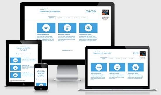
Mobile portrait (320×480)
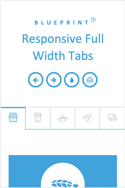
A fantastic solution for websites with few navigation items. The tabs are large enough to be operated even with gloves on.
Demo and download
Responsive Retina-Friendly Menu
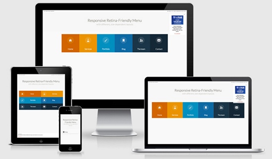
Mobile portrait (320×480)
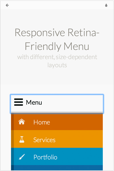
A very unusual solution for blogs and websites with few navigation elements. By using icon fonts instead of pure graphical icons this solution becomes retina ready. What should be mentioned is that tablets show a different menu than smartphones. On tablets it’s a list of layered menu items (either side-by-side or on top of each other) whereas on smartphones it extends by a click.
Demo and download
Responsive Multi-Level Menu
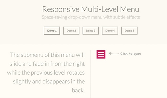
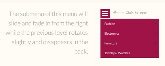
The Responsive Multi-Level Menu picks up an old idea refined with many interesting effects. Unfortunately, they can’t be captured on screenshots. Therefore, I would recommend you to visit the site. You can choose between 5 different effects.
Demos and download
MULTI-LEVEL PUSH MENU
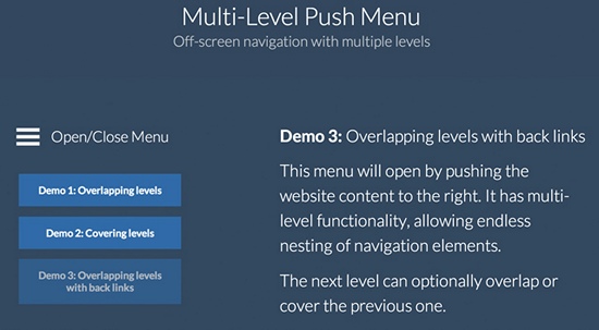
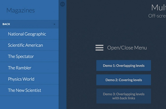
The same here. They picked up an old idea and refined it. The implementation, however, follows a well-conceived approach as the overlapping levels are designed extremely user friendly. The menu items are also large enough to be accessed with gloves on.
Demos and download
Slideout Menu
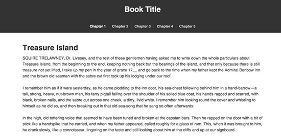
Mobile portrait (320×480)
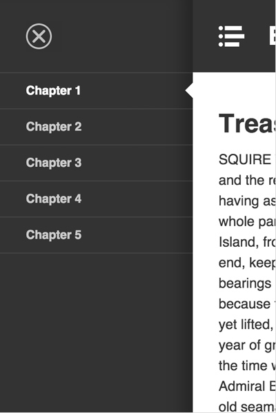
The Slideout Menu is a tutorial by our big sister SmashingMagazine.com and suits perfectly for websites that have a lot of menu items.
Demo and download/tutorial
Off-Canvas Menu with a Twist
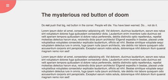
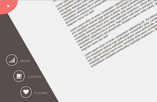
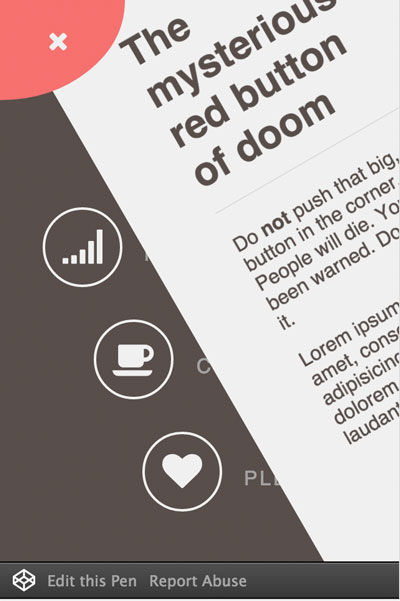
This is the most appealing solution I have come across so far. It’s suitable for the desktop as well as mobile view. Unfortunately, the mobile view only shows the icon buttons whereas the writing is hidden.
Mobile portrait (320×480)
Demo and download
Pull Down Menu Interaction
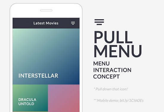
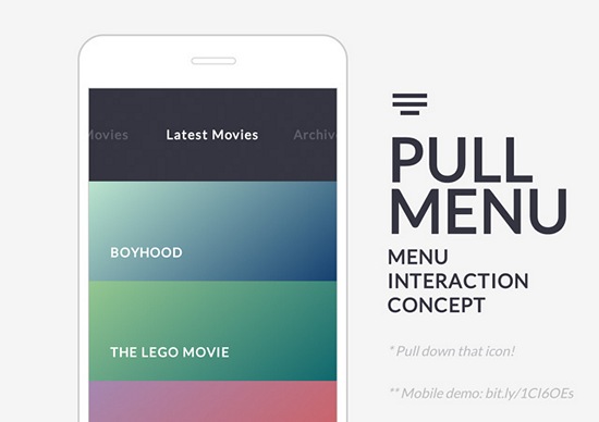
The Pull Menu offers a very interesting and innovative concept which is well implemented. Menu items can be chosen by pulling down the menu icon as far as necessary. By releasing the icon the item will be loaded.
The menu pulled down
Demo and download
Google Nexus Website Menu
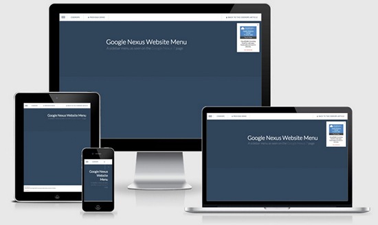
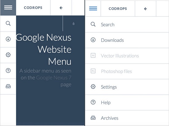
The Google Nexus Website Menu is not only a menu for smartphones and tablets but works for all screen resolutions. What makes it interesting is that you only have to add one navigation during the project’s development process. By tapping on the menu item in the upper left corner, the menu slides out a bit. The full list opens when you hover over one of the items.
Mobile portrait (320×480)
Demo and download
Social App Menu
The active menu
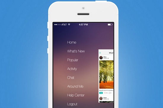
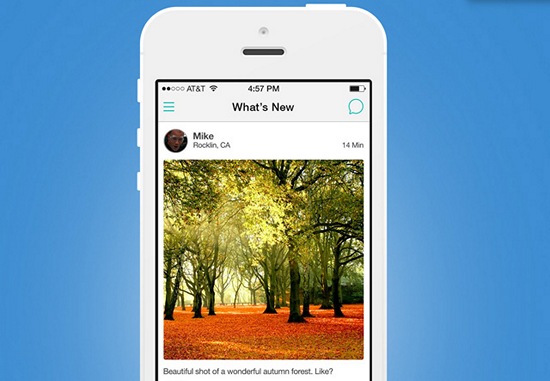
This is also based on an old idea, however, with a completely new approach. It’s well made and definitely worth a closer examination.
Demo and download
jQuery Plugins for Responsive Navigation Menus
jQuery Navobile
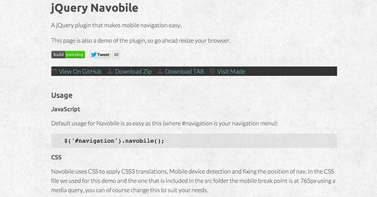
Mobile portrait (320×480)
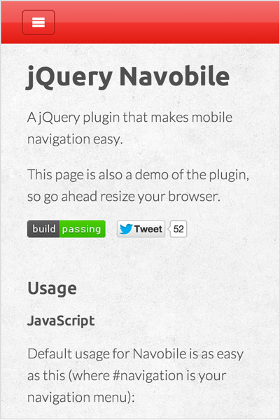
Demo and download
jQuery.mmenu
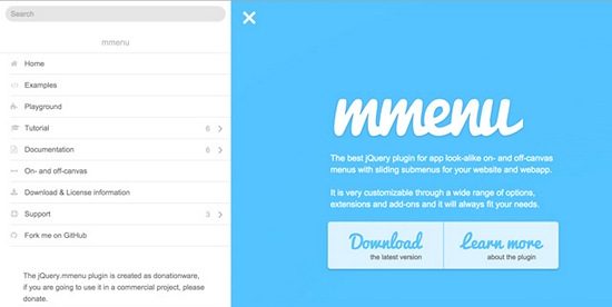
Mobile portrait (320×480)
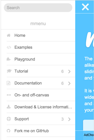
This plugin stands out from the crowd because it offers completely new approaches with an integrated search and appealing submenus.In addition, it’s not only a mobile menu but suitable for all website resolutions.
Demo and download
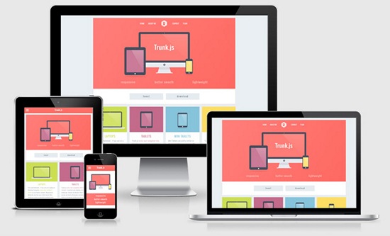
Trunk.js – A Responsive Web Solution
Mobile portrait (320×480)
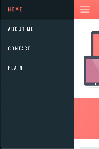
Trunk.js is one of the most frequently used solutions when it comes to responsive navigation. It works smooth as silk, is pretty fast and suitable for websites with lots of navigation items.
Demo and download
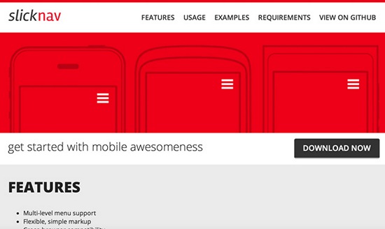
SlickNav – Responsive Mobile Menu
Mobile portrait (320×480)
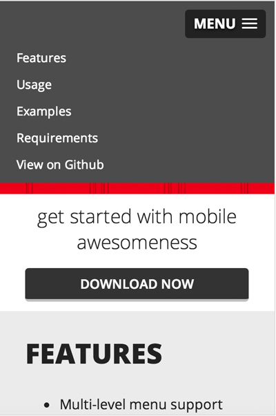
SlickNav is a well-working plugin which can, however, only display the responsive, mobile version of a navigation menu. This makes it work well and fast, so SlickNav is always an option in the development process.
Demo and download
Examples for Well-Implemented Responsive Menus (Non-Downloadable)
The following examples show how responsive mobile navigation can be optimally implemented. The websites have extraordinarily designed navigations and can be a real inspirational source for your own website.Lotta Nieminen – Graphic Designer
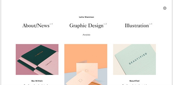
Mobile portrait (320×480)
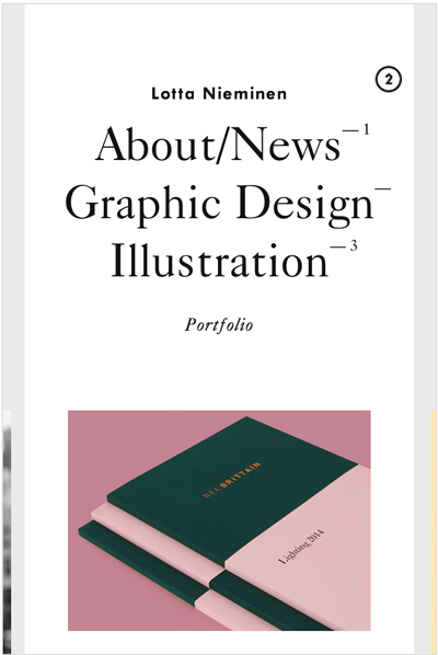
This solution is becoming more and more popular for websites with few menu items. The menu items are simply put on top of each other using CSS and can be accessed quite easily.
Link to the website
Ableton
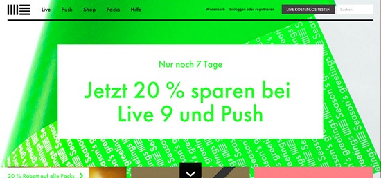
Mobile portrait (320×480)
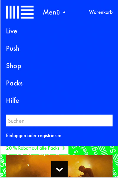
Ableton relies on a pull-down menu with an integrated search function and links to the cart and one’s profile. A good example for user friendliness.
Link to the website
Digital Atelier
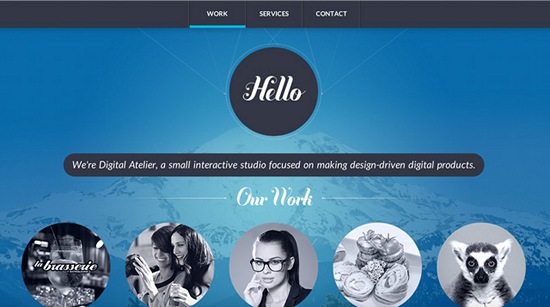
Mobile portrait (320×480)
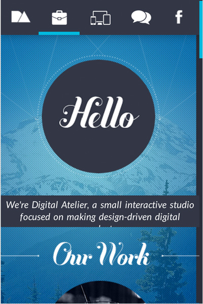
Digital Atelier has a pretty outlandish and unique mobile navigation. It can be operated with gloves on but resolutions of 800×600 and below don’t show writings of the mobile navigation.
Link to the website
CSS Tricks by Chris Coyier
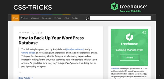
Mobile portrait (320×480)
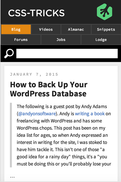
The grand master of CSS, Chris Coyier, takes the easy way out with having only few menu items. Using CSS, he lets the navigation items flow either on top of each other or side-by-side. The result is nice as the menu items are of decent size guaranteeing operation with gloves on.
Link to the website
sketchin – evolutive experience design
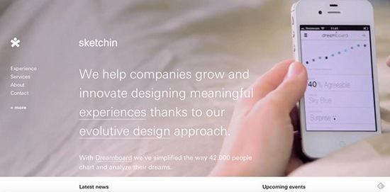
Mobile portrait (320×480)